Interface
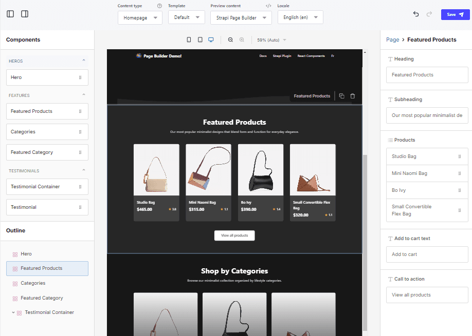
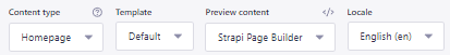
Content selection
- Content type: Select the Strapi content-type. Only content-types configured with
the
page-buildertemplate relation field will be available. See Manual Installation for more information. - Template: Select the active template in the editor or create a new one.
- Preview content: Select the CMS content to preview in the editor. Content will be available for dynamic substitutions using Handlebars syntax. Click on the
</>icon to see the data contained within. - Locale: Select the locale to preview the content in. When a locale other than the default is selected, page structure cannot be modified, only the content. Localized content is saved to a localized template.
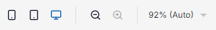
Preview controls
- Viewport selection: Toggle between mobile, table and desktop views. 2. Zoom in/out: Increase or decrease the zoom level. 3. Zoom select: Select the zoom level.
Sidebar toggles
Toggle visibility of the Strapi Page Builder sidebars.
Undo and redo
Undo or redo last actions. Actions are held in memory until the page is reloaded.

Save
Save your changes. Note that Strapi Page Builder templates do not use the Save and Publish feature. Template visibilty is managed by the assigned template on the content-type.

Preview Pane
Preview of the current template layout. Components can be selected by clicing on them and reordered by dragging.

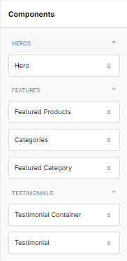
Component Selection
Components are added to the page by dragging and dropping from the sidebar.
Components can be grouped by category to simplify selection. See Component Configuration for more information.
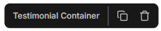
Component Controls
When a component is selected, an outline and overlay will appear in the preview pane and a control header will appear above allowing for duplication or deletion of the selected component.
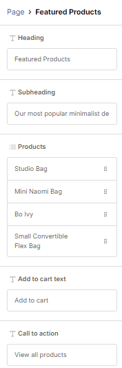
Component Settings
When a component is selected, the settings panel will appear on the right side of the editor. Here you can configure the component’s properties.
Available component properties are defined by it’s configuration. See Component Configuration for more information.